
The Filipino American contemporary painter, Jon Poblador, discusses his inspirations for creating his religious paintings – minimalist works characterized by monochromes, repetitions, and mark-making, and how his nomadic life has shaped his artist journey, and more.
- Can you share your background with us?
Having lived in the Philippines, Singapore, America and China before settling in Hong Kong, much of my nomadic life has been defined by impermanence and constant movement. This may explain why I was compelled to find a grounding source and dig deeper into my spirituality.
- What has your artistic journey been like, from living in the US to residing in Hong Kong?
Moving around was difficult for me as an artist. Mainly because it’s hard to establish a presence, build a community, and impossible to create an art-making space (studio) that is permanent. I move mainly due to my teaching job, and so, there is always a sense of thinking ahead about the possibility of moving again. With that said, the good thing is, new places and environments will tend to influence or expand ideas.
The most significant change, I would say, was my summer art residency in Beijing (2016) and then in France (2018). The concentrated time, and being able to focus on my work really opened up a lot of things: like the use of oil pastel and the return to the marks and words on paper. This made me look back again at some of my thoughts earlier in my career and many other series of work were born from this.
- Can you tell us more about your exhibiting works regarding developing concepts, mediums, and techniques?
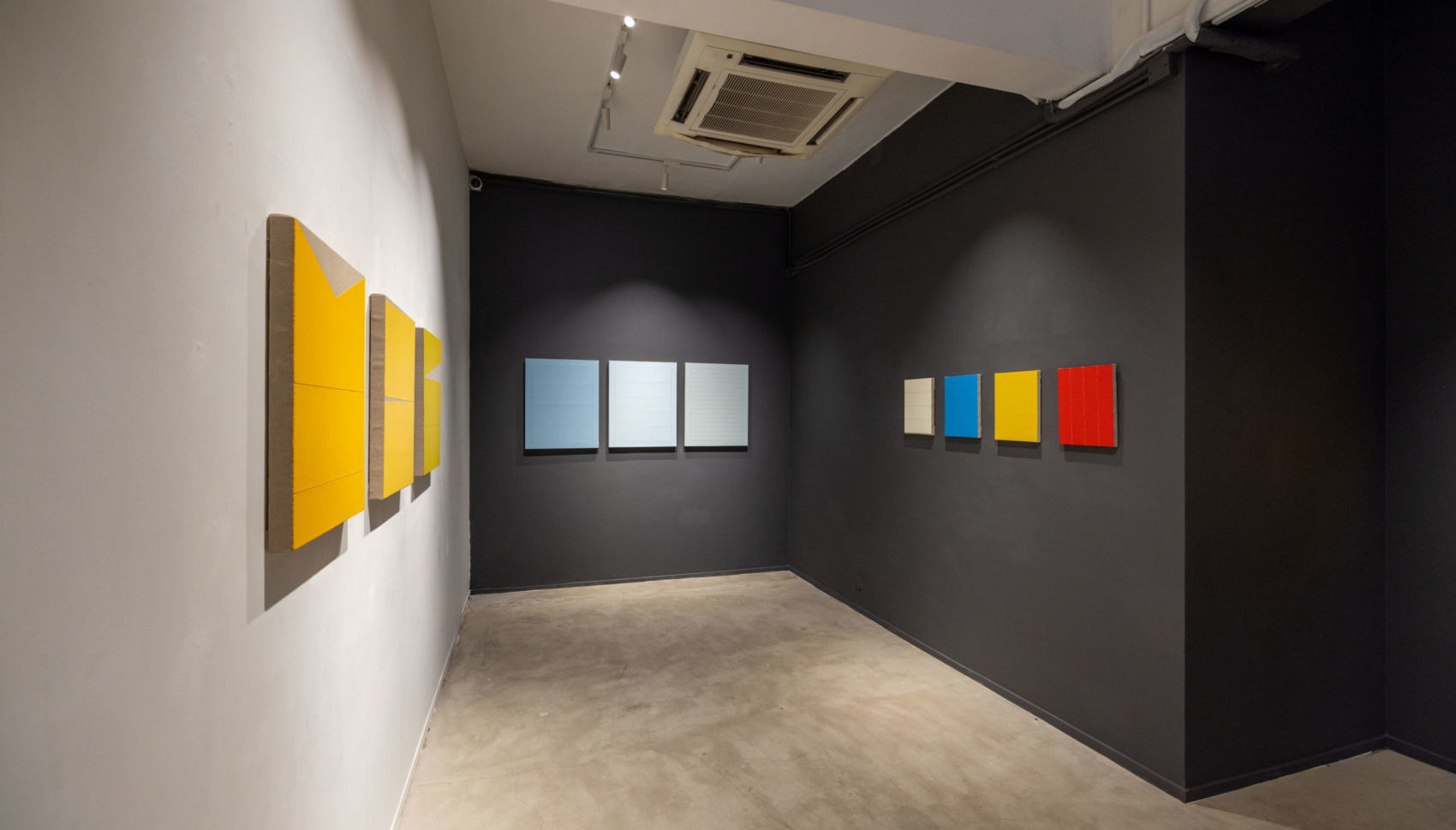
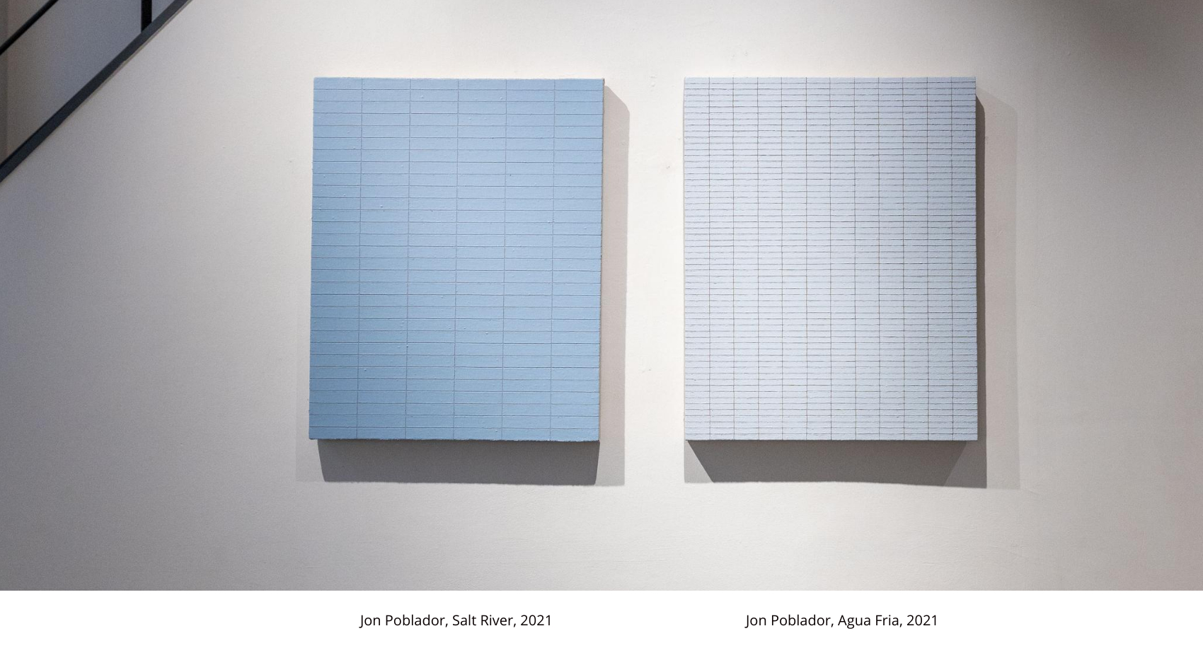
The idea of repetition and mark-making started with the works on paper, with the Words Series, in particular. I transferred the idea of marks to the paintings, however, I didn’t like the results because they were visually too busy. It wasn’t creating the mood I was looking for. Since I still wanted to keep the process of the marks, I started applying layers of paint on top of it — to cover it up and lessen its emphasis.
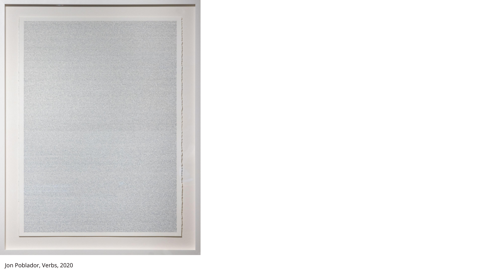
Around 2006, I decided to get rid of the marked layers underneath and experimented more with the colors and composition. The idea of marks merged with repetition. Kind of like a micro/macro level. Marks are made with repeating strokes over and over again, which is exactly the same process when applying the layers of paint. Again, the idea that they are both the same and different: two opposite things happening at once. That is how, currently, the works on paper relate to the paintings on canvas.
Mediums have always been in acrylic. Since I was applying multiple layers, the paint needed to dry quickly.
- As you refer to your works as ‘religious paintings,’ can you tell us more about how it is reflected through the creative process in three stages (calm harmony, movement, inertia) of the act of painting?
I describe my work as religious paintings mainly from the amount of faith and devotion and I have given to it. I mentioned something in an IG post about the slow, time consuming process that has nothing to do with patience — which is often a comment I get from people. Patience is about tolerating discomfort without anger. The fact that I prefer to have my face close to the brush so I can see the paint applied carefully to the surface is part of the concentration and meditation. I get lost in it. So, it’s not about Patience, but rather about love.
The challenge, then, is how do I share what I feel with others? Ultimately, the viewer only gets to see the product or outcome at the end. Their relationship to the artworks will always be different from mine. I think this is also where my choice of color comes in. I choose colors that I feel are neutral, calm, and free from agitation and distraction.
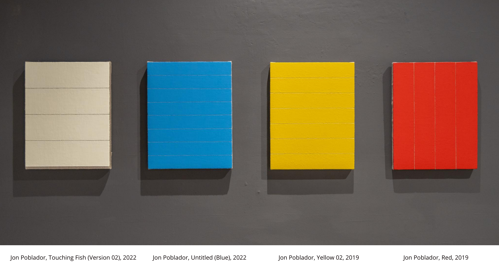
- Is there any reason behind choosing mainly primary colors and black and white in your paintings?
I might have answered this a little bit above. To be honest, the colors that I chose all came naturally and intuitively. Certainly, as I said, I use them for their emotional characteristics, but they don’t necessarily symbolize anything — even if I sometimes title my work based on places or bodies of water. I have used the same colors for over twenty years. I don’t see them as Mondrian would, but maybe there are some things about it to consider as well.
I often compare visual art and music. Colors are like sounds, and certain colors do not have the right sound I am looking for. It’s like writing a composition. I am not sure if a composer can explain their choice of notes or melody. Maybe they can.
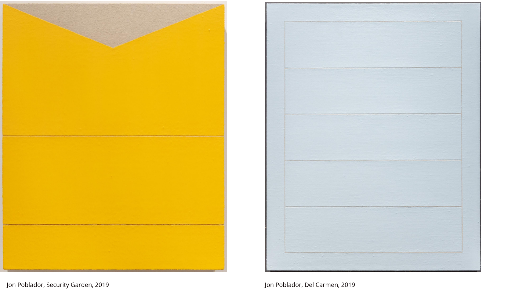
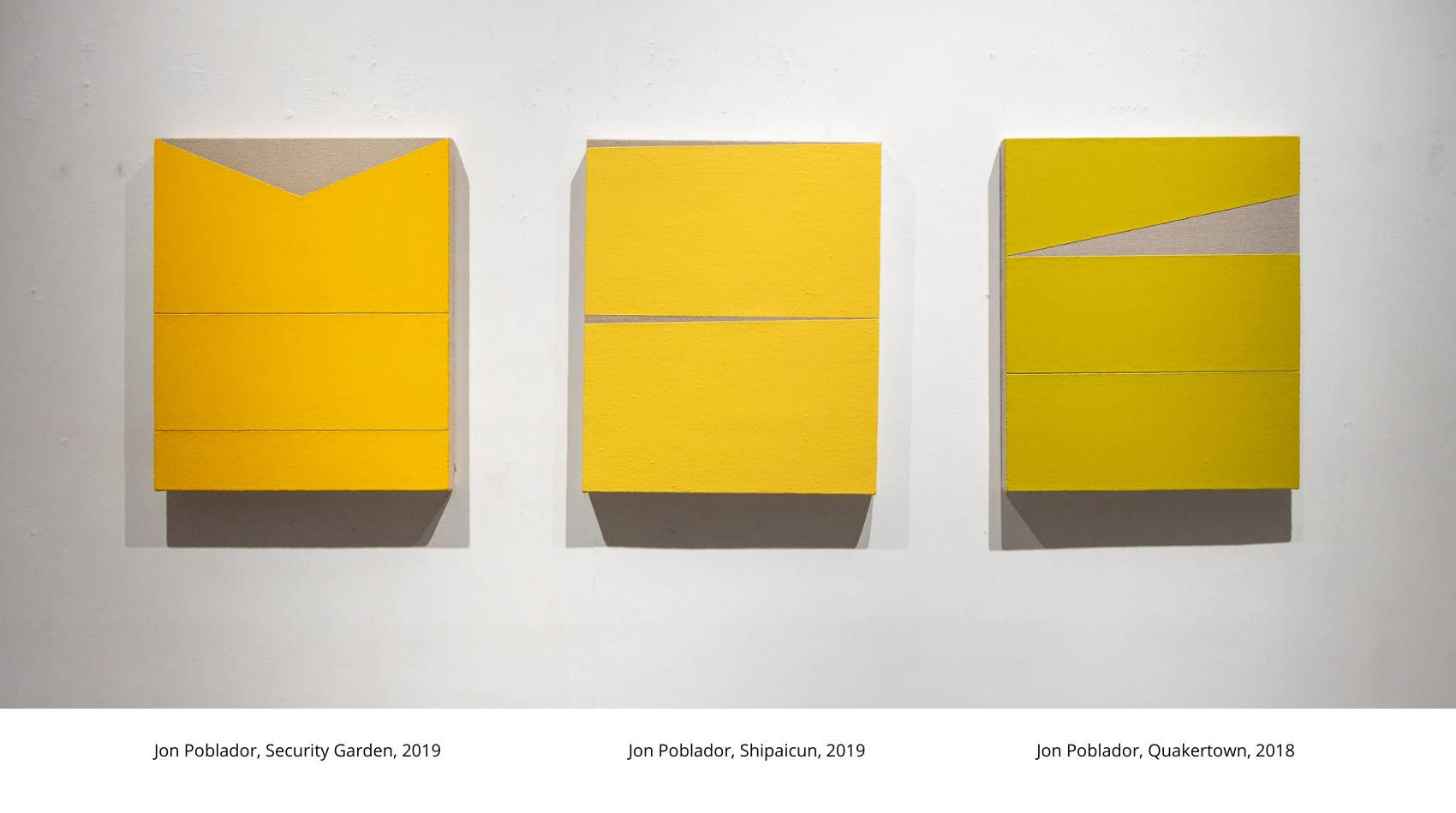
The more I think about this, maybe I can see colors like Mondrian. If I connect it with how I regard geometric shapes, primary colors, together with black and white, are as pure as they get. They are timeless. That purity of color is also the reason why I paint them matte and flat. I don’t want to create any kind of atmosphere so I don’t add any gradation, blending, transitions or soft edges.
About Jon Poblador
Jon Poblador (b.1971, Quezon City, the Philippines) is a Filipino American contemporary painter best known for minimalist works characterized by monochromes, repetitions, and mark-making. Having received both BFA (Northern Illinois University) and MFA (University of Pennsylvania) in the US, Poblador has always lived a nomadic life including in the Philippines, Singapore, America and China. The artist is currently residing in Hong Kong and is active in the contemporary art scenes in the city and the US, where he’s had several solo shows at Larry Becker Contemporary Art in Pennsylvania, Gebert Contemporary in Arizona, and Galerie Koo in Hong Kong.
Please visit https://www.solunafineart.com/for updates and details.