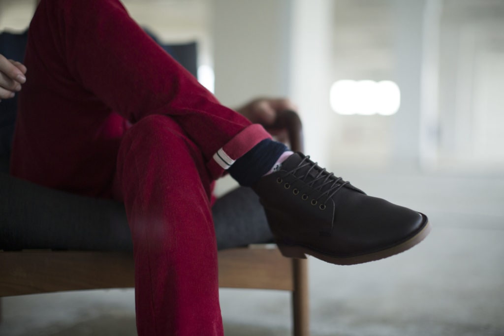
Humans are visual by nature. Up to 85% of people describe themselves as visual learners* so the old adage “a picture’s worth 1,000 words” is certainly based on truth. With just 16% of readers reading word-for-word** we know that people respond to images.

Research shows that web pages with relevant images had 94% more views than those without. But bigger is not always better. Competitor Monitor insights show that using too many images can result in the issue of information overload and consumers switching off.
So, what is the right balance?


I Heart Studios recommend these guidelines;
- Keep It Simple: Allow the focus to stay on the product.
- High Quality: Deliver the fine details demanded by today’s consumers.
- Angles: Provide all of the product information visually.
- Variation: An image for all variations of your product, e.g., different colours, textures, etc
- Detail: A detailed image is the next best thing to physically feeling the product.
- Context: Provide an idea of how the product will look or be used in different real-life circumstances providing a sense of the size and scale of the product.


If you are looking for balance in your online brand life, contact I Heart Studios to see how we can help.
*Trend Reports
**Neilson Norman Group “How Users read the web”

